● AI Slide Killer, Genspark Steals the Deck, Email Automation Cashes In
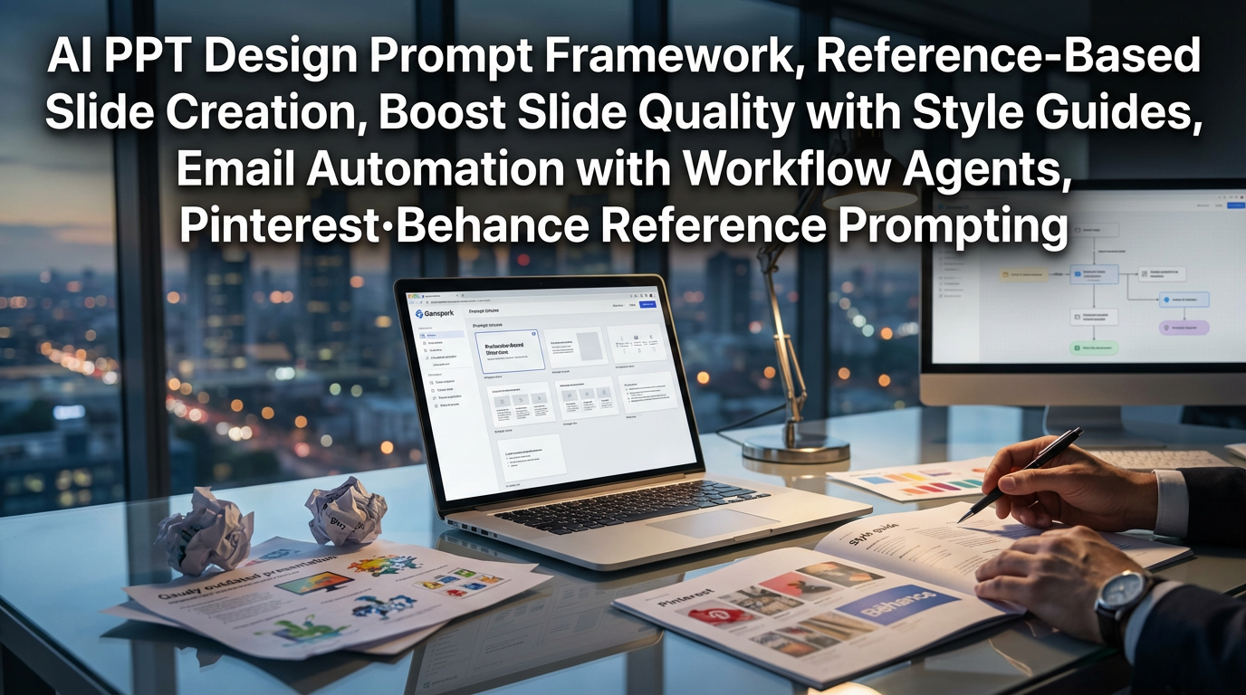
How to ‘End’ AI Slides: Core Point for Raising PPT Quality with Genspark (Style Guide · References · Email Automation)
This post contains exactly three things.
1) Prompt structure and style guide that solve “Why do AI slides keep looking tacky?”
2) A practical workflow to directly replicate Pinterest/Behance references as your own template
3) A point more profitable than slides: how mail and work automation agents overhaul productivity (and why this matters)
1) News Briefing: One-page summary of the original core point content
[core point issue]
When you create slides with AI, the problem repeats: “fast but tacky / text breaks / design is awkward.”
The original text proposes solving this problem with a combination of Genspark’s model selection + style prompt + reference images.
[Product/Results]
Genspark positions itself as an all-in-one AI workspace.
According to the original claim, it emphasizes achieving $100 million in annual revenue within 9 months.
[Most practical point]
The “AI Slides” feature inside Genspark (HTML-based) can produce awkward results if used directly.
Instead, specifying “Generate slide deck with Nano Banana Pro” in the basic agent window significantly raises quality.
[Style options (original examples)]
– Editorial magazine (black & white, minimal)
– 3D isometric
– Vento grid (Apple-like feel)
– Flat minimal (most neutral and work-friendly)
– Neumorphism / Glassmorphism (polarizing)
– Noling (design exploded-diagram feel)
– Hand-drawn note (text glitches are absorbed as ‘aesthetic’)
– Stylish typography (text-impact focused)
[Reference-based production]
Collect screenshots of designs you like from Pinterest/Behance and attach those images to say “make it in this feel” — doing so greatly improves consistency in results.
[Work automation extension]
Genspark can connect externally (Google/Notion/MS etc.) to create ‘super agents’ that automate email sorting, classification, and draft replies.
It particularly notes that generating large volumes of “polite rejection email drafts” produces a strong practical impact.
[Promotion/Event (original claim)]
They state that AI chat / AI image features will be offered ‘unlimited’ through 2026.
Mentioned models: Nano Banana Pro, GPT Image, Gemini 3 Pro, GPT-5.2, Claude Opus 4.5, etc.
2) The real reason slide quality diverges: HTML slides vs model-based slides
Why do “AI slide features” sometimes look tacky?
Many tools’ automatic slide generation relies internally on HTML templates/layout rules, and this approach tends to produce “safe but bland results.”
Especially for information-dense plans/reports, a small layout shift can make it look like a “ten-year-old template.”
Solution proposed in the original text
Rather than entering the slide menu, specify “Generate slide deck with Nano Banana Pro” in the basic agent.
This point functions like a device that steers output more toward “design generation” than “template generation.”
Why this matters (productivity perspective)
Teams with limited design outsourcing/internal design resources find slides directly affect brand trust.
As materials accumulate, slide production time unexpectedly accounts for a large share of work productivity, eventually adding to the team’s overall cost structure.
Especially organizations that operate by project, this accumulated time can be fatal in an economic downturn because the same headcount must produce more output.
3) Practical prompt templates: design with ‘minimum keywords · maximum layout’
The most practically effective tip from the original text
Including “minimize text and structure around keywords” drastically reduces text breaking, typos, and alignment collapse.
Prompt structure you can use immediately (example)
1) Purpose: Fix the purpose first, e.g., “for investors/executives/customers”
2) Style: Choose one, e.g., “flat minimal / vento grid / editorial”
3) Constraints: “minimal text, keyword-focused, one message per slide, simplify charts”
4) Output: “16:9, 10–12 slides, title-core-evidence-summary structure”
A single extra line that improves quality
“Keep font/color/icon styles consistent across all slides.”
This single line significantly reduces the ‘random generation’ feel.
4) Recommended style guide: what to use to minimize failure risk by situation
1) Flat minimal (work default)
Most stable for reports/strategic planning/sales decks.
Its strength is “readability + a tidy sense of trust” rather than flamboyance.
2) Vento grid (strong for product/service introductions)
Breaking information into boxed units makes dense slides look less cluttered.
3) Editorial magazine (strong for executive reports)
Black-and-white and restrained tones sharpen the message.
It particularly fits topics where exaggeration is undesirable, such as tech trends (e.g., quantum computing, semiconductors, AI infrastructure).
4) Hand-drawn note (strong for training/workshops/internal sharing)
Because text may slightly glitch but is forgivable as a style, it helps escape perfectionism and gain speed.
5) Typography (when you need one strong message)
Effective when designing the slide as ‘copy’ rather than as ‘sentences.’
It works well for seminars, conferences, and internal town halls.
5) Reference equals skill: Pinterest/Behance screenshot strategy
How the original text solves the “hard-to-express image in words” problem
Perfectly describing the image in your head into a prompt is difficult.
Therefore, collecting 10–20 reference images is the cheapest and fastest practical solution.
Practical workflow
1) Search Pinterest/Behance with keywords like “infographic / report / slide / editorial”
2) Screenshot styles you like
3) Attach the screenshots
4) Request “Reconstruct my content into a 10-slide deck in this style guide”
Why results improve (reinterpreted)
AI makes much more consistent design decisions when it has references — a “answer key” — than when creating from nothing.
This is the same principle as giving an AI agent an SOP (standard operating procedure) for tasks.
6) Bigger than slides: email automation changes the time budget
The part of the original text with the biggest practical value
Slides are visible deliverables and attract attention, but what really eats workers’ time is communication tasks like “email/scheduling/replies/organizing.”
Genspark super agent usage flow (original summary)
– Automatically classify emails (important/invite/partnership, etc.)
– Generate large volumes of “polite rejection email drafts”
– Create a morning email assistant agent that runs automatically at a set time each day
Why this matters economically/organizationally
For individuals, it recovers “1–2 hours per day,” but at the team level it changes labor cost structures.
In an environment with rising interest rates and ongoing cost pressure, this kind of automation yields effects similar to fixed-cost reduction.
Ultimately, companies will accelerate digital transformation and automation, and this trend is likely to intensify through 2026.
Meanwhile, individuals will diverge into those who use tools and those who continue the old ways, creating productivity gaps.
7) The most important things other YouTube/videos/news rarely mention (blog perspective core point summary)
1) The battle over AI slides is decided by ‘input method’ not ‘feature’
Using the slide menu tends to produce template-based averages, while specifying agent + model + constraints elevates the output to a ‘design deliverable.’
2) References are not “taste” but “data”
Ten to twenty screenshots are not mere taste collection; they act as a dataset that trains the AI’s design decisions.
3) Bigger ROI than slides comes from ‘communication automation’
The tasks that truly consume company time are email, replies, classification, and coordination, not PPT.
Once automation is applied here, an individual’s weekly productivity curve changes.
4) “Unlimited” promotions are not just short-term perks but signals of market strategy
Offering “unlimited” through 2026, as the original claims, is likely aimed at creating habitual use (lock-in) rather than being a mere event.
If individuals/teams lock in workflows during this period, they will find it hard to switch tools even if prices rise later.
5) From an investment perspective: ‘AI workspace’ is a battle over an operating system, not an app
When chat/image/slide/email/integrations/agents converge in one place, users increasingly “stay inside” that environment.
This suggests that platform dominance could grow in complex workplace ecosystems similar to global supply chains.
< Summary >
To raise slide quality with Genspark, use the basic agent and specify the model (e.g., Nano Banana Pro) to generate a slide deck rather than using the AI slide menu.
Minimize text and focus on keywords, and choose styles that match purpose such as flat minimal / vento / editorial to reduce failure risk.
Attach 10–20 Pinterest/Behance reference screenshots to get far more consistent designs.
Greater productivity gains come from agent automation for email classification and draft replies, which is especially valuable under cost pressure.
[Related articles…]
- AI Workspace War: How All-in-One Productivity Tools Are Changing Work
- Interest Rate Environment Changes and Corporate Automation Investment Strategy: Checkpoints Through 2026
*Source: [ 월텍남 – 월스트리트 테크남 ]
– AI 슬라이드 종결 짓습니다. “스타일 가이드”와 “레퍼런스” 꿀팁까지…[Genspark.ai]