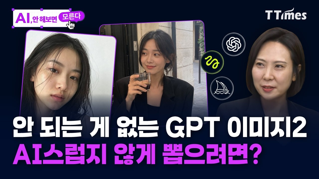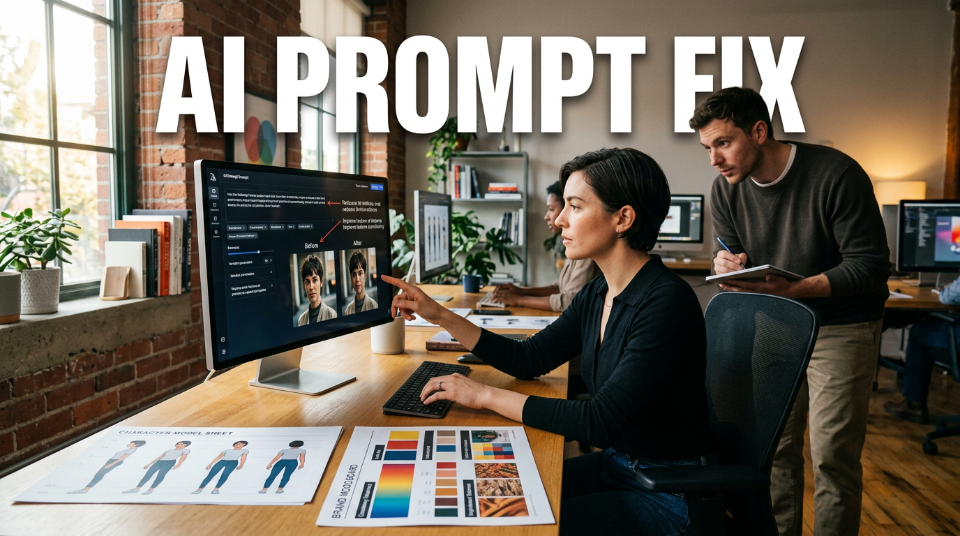
● AI Photos Blur the Line Between Humans and Reality
“Even though the face doesn’t change, it looks like a person” Comprehensive roundup of real-world know-how from in-house designers to reduce AI image “AI-ness” (the feeling that it’s AI)
Starting with the core point you can use right away (it’s in this article)
- It starts with the on-site diagnosis that in SNS and on the internet, distinguishing AI images from real photos is now nearly impossible.
- Yet, in response to the question, “Why does my output still look like AI?”, it breaks down—step by step like news—a tool combination + prompt formula + editing workflow that working designers actually use.
- In particular, instead of a “click-and-done” approach, it bluntly says that the deciding factor is variation (generate multiple images and choose the best) + maintaining consistency.
- At the end, it summarizes the real reason that brand pre-research (mood/philosophy/shot requirements) determines the quality of the results.
These four are the core of this article.
1) Why has AI risen to the point where “distinction” is getting difficult these days?
-
The conclusion from the interview is this.
AI started to look truly human—not just because of model performance, but because professionals run learning/compositing/editing like a “package”. -
Especially, the following elements come together and reduce the “AI-ness.”
-
Facial details shift not into “a form where the face changes,” but into an “expression-preserving flow”
-
Lighting (highlights/shadows) and material feel (wrinkle/skin texture/fabric texture)
-
Camera mood (film grain, a mobile shot feel, shakiness, etc.)
-
Not one single image, but a structure that creates multiple shots as a set and locks in consistency
-
So back then, “AI-specific weirdness” was easy to spot, but now that boundary has blurred.
2) How professionals reduce “AI-ness”: No “clicking through”—variation is the answer
-
The point designers repeatedly emphasized is this.
-
Don’t try to complete it in one go
-
Generate 10 or 20 images, then choose the “best one(s)”
-
Finish the shot you like with cropping/upscaling/editing
-
There’s also an analogy from the interview.
It feels just like real filming—shoot hundreds to thousands of frames, and only a few end up being “deliverable cuts.” -
In conclusion, AI, too, should ultimately be operated “like on-site filming”.
If you click-and-finish, it’s only natural that “AI-ness” remains.
3) Professional tool combination: GPT Image 2 vs Midjourney/Pixeld/Glokdo—divide responsibilities
-
The tool flow actually mentioned in the video can be summarized roughly like this.
-
GPT-based generation: strong at details/consistency/naturally looking results
-
Pixeld: often used for character/model customization and combinations
-
Midjourney: used for generating styles and mood categories
-
Claude (mentioned): used to organize mood boards/concepts and assist with research
-
Mention of Glokdo’s paid upgrade flow (indirectly mentioned as conversational generation assistance)
-
The core idea is not “using one tool well,” but rather building a pipeline by assigning distinct roles to each tool.
4) Making it “like a person without changing the face”: Lock consistency with a character sheet (grid)
-
This is the most practical part in this article.
The method professionals use is the concept of a character sheet. -
The approach is simple, but the effect is big.
-
Generate a set of various angles (front/side/close-up, etc.) in a grid like 2×2 or 3×3
-
Use those shots together when training the model (or doing character-unification work)
-
As a result, the face/expression/proportions don’t “break” all at once
-
Why do the grid?
As the interview says, it’s because at the character sheet stage, you need multiple angles. -
Especially these days, as model/tool performance improves,
they also say that problems that used to happen—like the face breaking (expressions drifting)—
and sudden changes have reduced.
5) The prompt formula (sentence tone that reduces AI-ness): “Rough naturalness” instead of “pretty/stylish”
-
The prompts designers hate the most are roughly in this category.
-
“Clean and stylish”
-
“Luxurious”
-
“Pretty like a model”
-
The reason is simple.
When you use words like that, the model over-shifts into an “AI-like polished/finished look,” which actually makes the “AI-ness” stand out. -
So instead, the keyword direction they often use is like this.
-
no-makeup
-
a rough/slightly blurry mobile-shoot mood
-
film grain that looks like an iPhone
-
eyes/attention shifting slightly off-center, not fixed straight ahead
-
There’s one more important perspective here.
Even if you pursue “naturalness,” if you go all the way into disorder, it fails—so it’s closer to adding the level of “direction details that a person would capture,” not just deliberately mixing awkwardness.
6) Edit quality control: Don’t keep iterating from the same original—edit after choosing the best
-
The trial-and-error that came up in the interview is this.
-
If you keep revising/regenerating from the original (the first generation),
the screen can turn grainy (a degradation feeling)
and the color tone can gradually change into something strange -
So practically, it’s organized like this.
-
From the initially created original
-
Choose the “best cut”
-
Finish with cropping/upscaling and some partial correction tools
-
They say that upscaling (resolution enhancement) is essentially “required” at the delivery stage.
But they also add nuance that paid tools/investment may be involved.
7) AI for video too? Why the “1 image + motion control” flow has changed dramatically
-
The practical point from the video is about “adding motion without filming.”
-
Use a one-image, face/person-based image
-
Apply the desired motion (click motion control)
-
The background/environment is composited by AI
-
What you see on SNS—things like “an animal talking video” or “dancing content”—connects to this kind of method.
-
The conclusion is, “It’s become more natural this year.”
They diagnosed that it used to look awkward, but with the passage of generations, the stability of faces/expressions/combination has improved.
8) The biggest deciding factor: Brand pre-research (mood board/philosophy/shot requirements) creates the results
-
This is the real one-shot deal.
Designers say that delivering quality results doesn’t work well with “just generating images.” -
Because each brand has its own mood/philosophy/expression style, and AI models don’t “automatically” match that.
-
So they do this as a pre-work step.
-
Collect keyword ideas from the brand mood board
-
Organize the shots that the brand wants (angle/framing/material/color tone)
-
After making the model, repeatedly generate to verify whether the “desired atmosphere” actually comes out
-
It’s also mentioned that you can use tools like Claude to organize mood boards first, then run the image pipeline with GPT/other tools.
-
In summary:
If research comes first, the AI result becomes “brand-consistent,” not just “plausible.”
9) Real-world applications professionals use often: Pages/grid/full-body shots/transition backgrounds
-
In the interview, there are several practical examples. The representative flow is like this.
-
Intentionally match the full-body shot ratio (mentions body proportions like 3-to-8)
-
Don’t create only one image at a time—make “a set” of “situation/framing”
-
Make background variations with AI as if you separately shoot backgrounds and composite them
-
Control with prompts by distinguishing tone like magazine covers (calm tone, cinematic mood, etc.)
-
Add product/logos/typography as layers and finish as a “deliverable-ready result”
-
Especially, they say that changing only the background is more efficient when you already have an existing model/base prepared.
10) The “real one-line formula” of this article: Put AI into your “design workflow,” not just “a tool”
-
The designer’s conclusion is pretty clear.
-
Don’t think of AI as separate
-
Run it as if you are “directly transplanting” your workflow (research → mood board → shot/layer composition → delivery editing) into AI
-
Then it doesn’t feel like a click-and-finish.
Instead, it feels like a result with the texture of something professionals actually shot and edited.
“Most important extra roundup” pulled from this interview that you don’t hear elsewhere very often
-
The core point to reduce AI-ness is not “making it prettier,” but “mimicking the texture of how a person shoots.”
So instead of phrases like “clean and stylish,”
elements like no-makeup/film grain/shakiness/off-center gaze are effective. -
It’s not about mastering one tool; it’s a real win in practice to have tool role separation + grid-based consistency (character sheet).
-
If you repeatedly edit the original, it may degrade, so picking the best cut first and finishing with cropping/upscaling/partial corrections leads to better delivery quality.
-
And the most money-making point is that without brand pre-research, AI results are highly likely to end up as “just plausible images.”
SEO keyword check (core topics included naturally)
- AI image trends
- Generative AI prompts
- Image upscaling
- Character sheet-based consistency
- Brand research strategy
< Summary >When AI images become harder to distinguish from real photos, it’s not only due to model performance, but because professionals create consistency with grids (character sheets), generate 10–20 variations, select only the best cuts, and finish with cropping/upscaling/partial correction.
For prompts, expressions that give the “human texture”—like no-makeup, film grain, and mobile-shoot mood—are more effective than “stylish,” and above all, you must pre-research the brand’s philosophy/mood/shot requirements for the result to reach deliverable quality.
Video production is also improving quickly with the flow of “1 image + motion control.”
[Related Articles…]
- Hands-on generative AI prompts: 5 sentence structures that determine quality
- Image upscaling guide: a workflow that reduces degradation and turns it into delivery-ready work
*Source: [ 티타임즈TV ]
– ‘얼굴 바뀌지 않고 실제 사람처럼’ 마법의 주문 공개 (조선영 디자이너)